v0.15.0 · launching soon on WordPress.org

Responsive controls
for the block editor.

Visibility, dimensions, layout and typography — per breakpoint, on 12 core blocks, with a true mobile-first cascade.

Free version coming to WordPress.org. Pro launching soon — early-access subscribers get 30% off.
Responsive Controls
Hide on this breakpoint
Dimensions
Padding
Margin
Typography
Text Align
Font Size
Line Height
1.4
yoursite.com
375px

Welcome to our site

This content adapts across breakpoints using responsive controls — padding, font sizes, spacing and alignment change per breakpoint.

Get Started
Fast
Visual
Flexible
Built on native block editor components
v0.15.0· active development
GPLv2+ licensed
By the numbers

No bloat. No clutter.
Just the controls.

01
12
Supported Blocks
02
4
Breakpoints
03
27
Responsive Controls
04
0
jQuery Dependencies
post.php
Straight from wp-admin

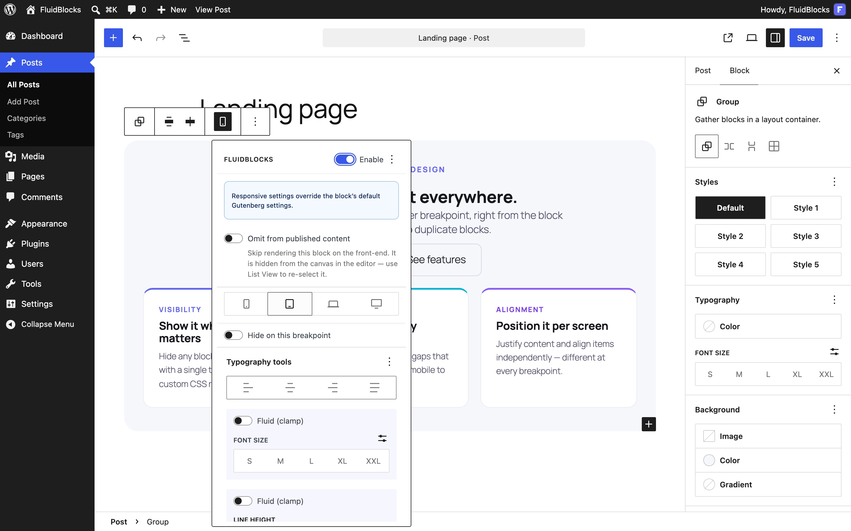
This is the actual plugin.

Not a mockup — a real screenshot from wp-admin. Every FluidBlocks control lives in the block toolbar: the breakpoint switcher, visibility, spacing and typography. Native WordPress components, nothing to relearn.

wp-admin/post.php
The Gutenberg editor with the FluidBlocks popover open: breakpoint switcher, visibility toggle, fluid typography and dimensions controls
  • Native @wordpress/components UI
  • Per-block opt-in — controls only where you enable them
  • Works in the post editor and the site editor

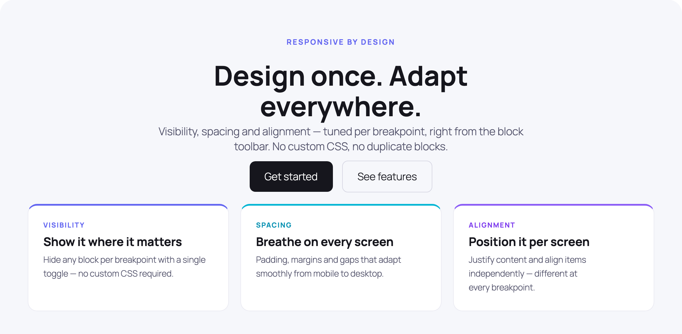
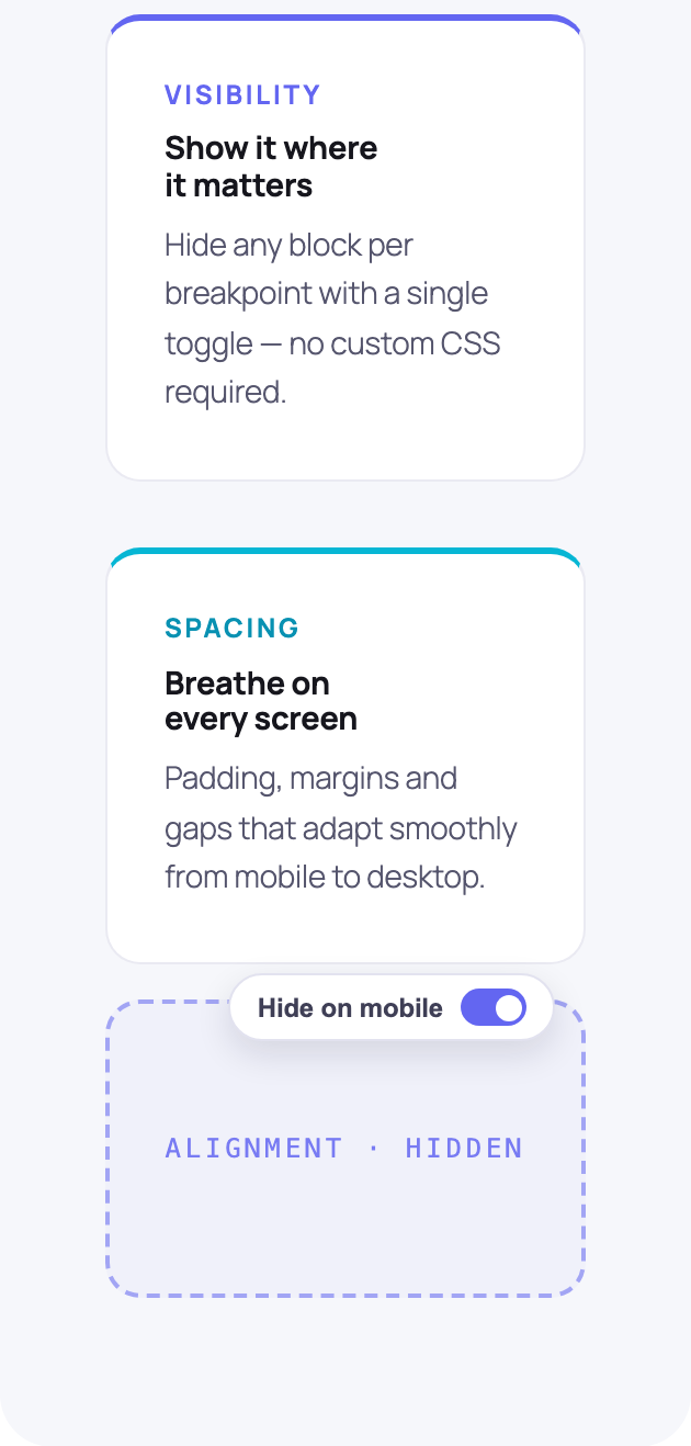
…and the published page. Same Group block — the third column is hidden on mobile with one toggle.

yoursite.com
Desktop·1024px
The published demo page on desktop: heading, buttons and three columns — Visibility, Spacing and Alignment
yoursite.com
Mobile·375px
The same page on mobile: content stacks and the Alignment column is hidden by the per-breakpoint visibility toggle

Total CSS shipped for that decision:

@media (max-width: 767px) {
  .fb-3 { display: none !important; }
}

One rule per decision. No wrapper divs, no utility soup, nothing to purge.

For everyone shipping with the block editor

Built for the people
who design responsively.

01Designers

Pixel-perfect on every screen.

Tweak padding, font sizes and column widths per breakpoint without leaving the block toolbar. No Figma round-trips, no devs to nudge.

  • Visual breakpoint switcher built into the toolbar
  • Native SpacingSizesControl — no custom UI to learn
  • Live preview as you change values
02Developers

Stop writing one-off CSS.

Stop maintaining custom block extensions and ad-hoc media queries. Editors get the controls; you keep clean markup and a tiny CSS footprint.

  • Native @wordpress/icons + components — no React duplication
  • Zero jQuery, GPLv2+, audited dependencies
  • Per-block opt-in — only the controls you actually want
03Agencies & Freelancers

Ship sites without a custom theme.

Hand clients a real responsive editor. They tweak layouts, you keep the maintenance tail short — no PHP per project, no "small change" requests.

  • Works with most block themes out of the box
  • Pro: the responsive layout system — flex-child sizing, grid span, order — and fluid typography
  • Pro: White Label today; preset library & JSON import/export on the roadmap
Show, don't tell

One block.
A value for every breakpoint.

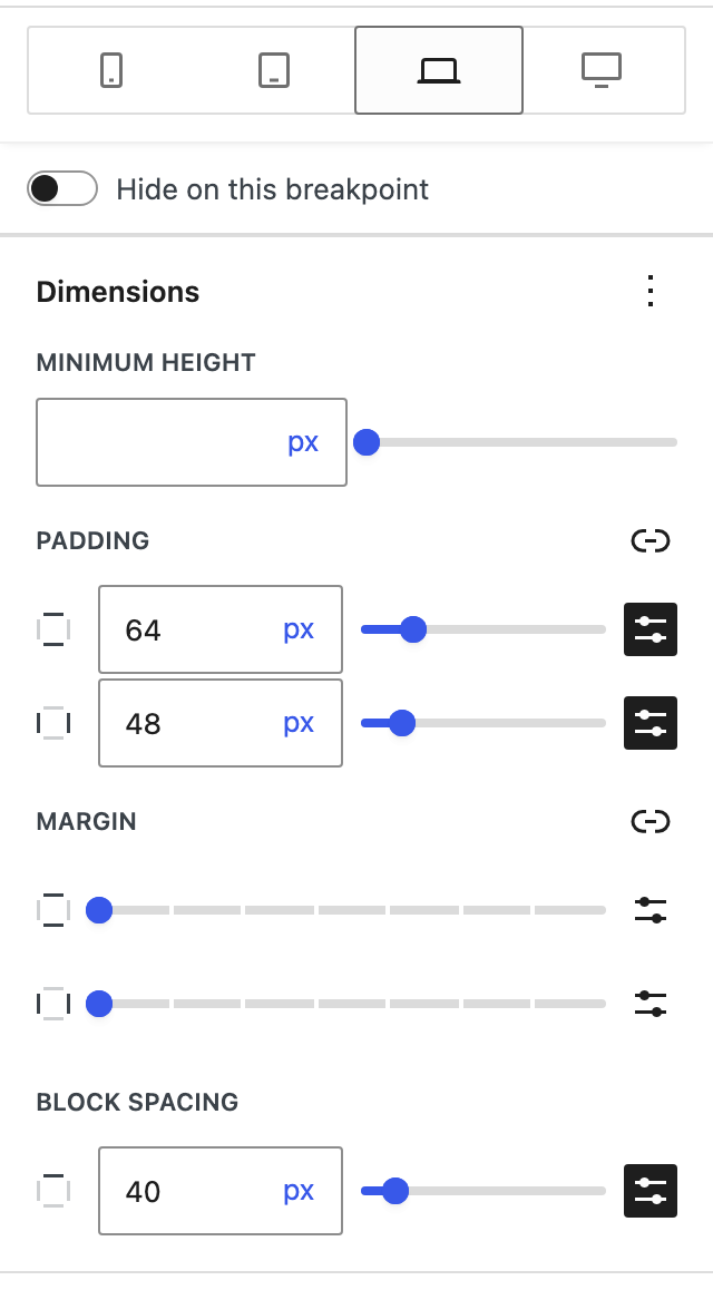
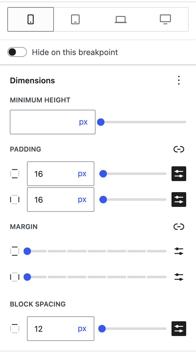
It's the same Group block on both panels — only the active breakpoint differs. Padding, spacing and alignment each hold their own value per device, and the switcher lives right in the block toolbar.

Desktop · 64px
FluidBlocks popover on the Desktop breakpoint: padding set to 64 and 48 pixels, the laptop tab active
Mobile · 16px
FluidBlocks popover on the Mobile breakpoint: padding set to 16 pixels, the phone tab active
Compare plans

A complete free baseline,
a Pro layout system on top.

Features
Free$0
Coming soonProfrom $49/year
Visibility & spacing
Visibility (show/hide)
Padding & Margin (4-side)
Block Spacing (Gap)
Width · Image height · Min. height · Spacer height
Aspect ratio (images)
Typography
Font size · line height · align
Letter-spacing · text-transform
Font family · weight per breakpoint
Soon
Fluid typography (clamp ranges)
Layout
Justification & Vertical alignment
Flex wrap · Grid columns
Content & Wide Width · Grid min. column width
Flex-child sizing · Grid span
Order (with negatives)
Container queries
Soon
Decoration & media
Colors with hover · focus · active
Soon
Borders (4-side · style · radius)
Shadows
Soon
Backgrounds (image · gradient · position)
Soon
Image srcset & background video
Soon
Platform
12 core blocks
Custom breakpoints
Developer API (PHP filters · JS hooks)
Mobile-first cascade · soft-hide
Copy & paste settings between blocks
Presets · Sync · Import-Export
Soon
White Label
Email support
Community
Priority

Be first when
Pro launches.

One email when Pro opens for purchase — waitlist members get 30% off any plan during the launch window.

No spam, no drip. One email when Pro launches, that's it.